Archive
what I have learnt
Overall throughout the course of these assignments I have learnt a great deal and enabled me to develop my Photoshop skills and adapt these to suit the b movie genre for the target market audience. Including the curve tool and the brightness and contrast tool to enable me to adapt and add elements within my lobby card design as a whole. I also learnt how to develop my drawing skills including using different textures and materials to enable me to develop and incorporate this with my design as a whole for the target market audience. This also enabled me to develop the techniques such as scale shape and size to enable me to make the scale consistent throughout this piece of artwork for the target market audience.
Furthermore I learnt how to use the color overlay tool to enable me to develop the main body of my illustration and to adapt this in to the base of the lobby card counting the washed out color schema as a whole replicating the b movie style for the target market audience. I transformed all of this in to my own work to enable this to be in an effective form of graphical manner for the target market audience.
Final design
This is the final design for my lobby card. I adapted on my previous designs and developed this even further to finalize this for the target market audience. i used the dafont software to enable me to do the typographic font within this design to make this effective for the target market audience and convey the genre of the movie in an effective manner. I used a washed out colorization to enable me to convey the b movie genre in a mixutre of old and new graphical elements. i think the photographic imagery and well as the graphical elements used within this convey our movie a great deal of amount for the target market audience. i added a graphical image to the main base of this design to make this more effective for the target market audience. i used the rubber tool on the Photoshop software to fade out some of this to make it look effective and convey a sense of sifi. I think by doing this will enable this to stand out a great deal of amount from a distance to enable this to forfill the purpose and convey our movie. i used photographic imagery from clips of our movie through out to add elements from our movie for the target market audience. I used the grid format after looking back at my previous research and combined this in to my final design. There and many good elements within this design as a whole but many things that can be improved to make this more effective for the target market audience.

Good elements within this design as a whole:
Overall I like the whole complex of the design. Such as the lettering used within this is simple style of lettering but in an effective manner standing out a great amount for the target market audience. The color within this is really effective and suits the whole color scheme of this piece. The robot used as the base of the design blends in nicely with the background as a whole making this effective for the base of the lobby card. The colors within this also blend in a great amount for the target market audience. The combination of the graphical imagery and the realistic imagery makes this look professional and effective from a great distance to help convey the movie for the target market audience.
Elements that could be improved:
Although there are a great amount of good elements within this design as a whole there are many elements that could be improved to convey the film further. Such as there could be a greater use of blending modes to make the images within this to flow through in a complex and effective manner. Also the typographic imagery could be in a more complex form to add a great amount of graphical elements suitable for the target market audience.

i then added a light bheam to this by choosing the lighten option and used the curve tool to enable me to edit the colours within this as a whole to suit the main body of the lobby card itself. i think this design compared to by previous design is a great deal more effective for the target market audience. the title stands out a great deal of ammount compared to the design with the big centre imagery derawing this away from the main title itself.

Developing the typography by hand
I then experimented with typographic imagery and formatted this containing symbolism and graphical elements to relate this to the genre of our b movie. After I formed this I scanned this in to the computer and started to form this in such a manner to help blend this in a style related to my lobby card design. Overall I think this form of typography formed as a whole is quiet effective suitable for the sifi genre for the target market audience. The colourisation used within this typographic imagery is very effective also the power of the red within this represents visually power through the use of this colourisation it conveys this very effective for the target market audience. If I was to redesign this as a whole I would combine a range of graphical elements and materials within this design as a whole such as: paint, charcoal, chalk and pen. This could convey a range of skills throughout the design as a whole and also make this suitable for the target market audience.


i then put this in to the photoshop software and manipulated this format into the colour format from the back and white. i used the curves tool to enable me to colourise this and make this effective for the main base of the design and effective for the target market audience. the blue glow around this typographic imagery makes this stand out a great amount for the target market audience. i also used te hue and saturation tool to ad tone within this graphical imagery to enable this blend in nicely with the main base of the lobby card previously designed on the photoshop software, i think i could of used more of a filter within this to make this more appealing as well as graphical imagery and symbolic imagery to help convey this in a effective manner. although i diddnt use this for the main base of the lobby card doing this step by hand enabled me to develop these skills for the future when designing typographic imagery suitable for the target market audience.
Although i didn’t use this on the final design of my lobby card it gave me an idea what typographic font i could use on the min body of the lobby card and use many elements within the photoshop software to make this appealing for the target market audience. I could also use many effects within this software to convey the genre of our b movie and make this effective for the target market audience. i will use the blend mode options as well as adjust the lighting as a whole to blend in with the main body of the lobby card as a whole. i think overall althought this is very effective for the target market audience, and conveys the genre of our b movie very well with the use of a range of effects to enable to forfill this.
Developing my design
I first started to form the base design of my lobby card militating photographic graphical imagery off the internet suitable for the theme and the target market audience. This will enable me to make this into a retro effect for the B movie genre and style for the target market audience. I then went on the dafont software and chose a form of typographic imagery suitable for the sifi genre of the movie which will also blend in and work well with the graphical elements in the base background of this design. overall i think i could of chosen a better font form for this because after feed back people throught this font was hard to read from the distance if i was to dio this again i would pick a differnt for of typographic imagery suitable for the target market audience.

I then edited elements of this typographic imagery on the Photoshop software to make this my own style of effect. I used elements within this such as the blend tool, hue and saturation, opacity tool to enable this to blend in with the design effectively, and many more to enable this to stand out a great amount for the target market audience. After looking at my previous research I chose elements within these and adapted these elements within my own design. There are many good elements about this design but many things can be improved to make this more effective as a whole.

Good elements about this design:
Overall so far I think this design works really well for the whole theme and relates well for the target audience in a graphical form of illustration. The colourisation used within this blend in a great deal of amount conveyi9ng a sense of mystery and a hidden message within this design. When developing this as a whole went really well and the Photoshop software enabled me to add effective elements to help generate this. After looking at my previous research I used elements within existing designs to help develop this even further. I think the overall design is quiet complicated containing many different elements. if i was to redesign this even further I would make this simpler with less use of objects within this graphical use of imagery.
Elements that could be improved within this design:
Overall there are many things within this design that could be improved for the target market audience such as: The design as a whole doesn’t generate the style of the b movie genre of style. After looking at my previous research many elements of the imagery use within these designs have a washed out retro effect for the target audience. The graphical imagery used within my design contains a bold graphical element which doesn’t convey the main purpose of this as a whole. Furthermore there could be a lot less detail within this design to make this simple but effective form of manner. The typographic design could also be in a simple 3d format to make this stand out a great deal from the background. I could also use a variety of materials to help me design this format to convey a variety of skills within this. Such as through the use of painting techniques as well as ink or charcoal.
Overall I think that this design is very effective for the target market and can be very effective for the purpose of this design. It conveys very well the message through the use of the very graphical imagery used for the target market audience. And conveys a sense of mystery within the design itself. to develop this even futher will scan in my tractings and imagery on to the photoshop software and use elements witnhin this to make this blend in in a very effective manner suitable for the target market audience.
i then looked back at this design and considered weather this could be done in a better format conveying the b movie genre for the target market audience. i decided to manipulate these graphical elements in to a retro form of manner conveying the sense of old and new elements combined into a final piece. i used a wooden texture overlay on this image to help add a great amount of more effects for the target market audience. to enable me to change the elements of colorisation within the image itself i used the curves elements tool to add elements of yellow and brown conveying the retro effect to the design as a whole. i also used the gradient tool within this softwe to add a sence of mystery within the design itself for the target market audience. overall there are many good elements within this design as a whole but many could be improved to convey this in a more effective manner. the use of the washed out colour scheame within this as a whole relates to the b movie genre in a very effective manner containing graphical elements giving this a futurist feel for the desing as a whole.

I then added a photographic image to the graphical design. By using the graphical elements within this Photoshop software enable me to blend this is successfully and effectively for the target market audience. I used the hue and saturation tool to enable me to get the contrast of this image to blend in with the main body of the lobby card itself making this look effective from a distance. I then thought up of a caption engaging and suitable for our movie itself. I used “fear will never be extinct” because it sums up in an effective manner what our movie is about and formatted in such a manner suitable for the target market audience.

I then developed t his design further in to editing the typographic imagery used for the main title body of this design as a whole. I changed the font of this to fit in with the design as a whole for the lobby card but also so its easy to read for the target market audience and came been seen from a great distance. I then changed the colourisation of this font as a whole to make this look effective and used the outer glow to this typographic imagery to bend in with the main background of this.

i then added the names of the people in the group and who are acting using a well known font in the photoshop software to enable me to do this and make this suitable for the target market audience as well as blend in with the whole sifi effect. i used the gradient tool also within this typographic effect to make this attractive from a great distance and stand out.

After looking back at my previous research in main versions of lobby cards many graphical elements contained a washed out effect on the main imagery within this giving an old style to this. Also typical typographic imagery in the 1950 used a great range of angles and symbolism within this to convey the genre of the film in an effective manner for the target market audience. i used the banner at the bottom of the main body of the lobby card using this technique through the use of my research making this text stand out a great deal from a distance for the target audience.

I then changed the format layout of this original design as a whole. i found an image off the internet for the background although to adapt this i used a great amount of techniques within the photoshop software to enable me to do this. such as the image adjustment tool. i then used a texture and adapted the optically of this to make this translucent and effective the imagery to suit the b movie genre. i also used the gradient tool to enable me to fade out the image slightly from the background to make this effective for the target market audience. the use of this adaptation makes this suitable for the genre of our b movie as a whole. i think although this layout as a whole very effective it washed out the main body of the robot as a whole drawing away the main character of the lobby card.

i then added a illistation to the main body of the lobby card adding a cartoon effect to this conveying a range of skills throughout out this. i think this looks quiet effective using a contrast of graphical features as well as the use of cartoon to make this effective for the target market audience. the use of the old style feature of this conveys the b movie genre and style in a quiet effective manner with a contrast of elements within this such as the typographic imagery.
There are many good elements about this final design of my lobby card. But many could be improved and developed even further to help convey this film in an effective manner for the target market audience. I used the Photoshop to enable me to do both elements within this lobby card and add a variety of graphical effects to make this appealing for the target market audience.
Good elements about this design as a whole:
Overall I like the concept of this design as a whole. It contains a great range of graphical elements throughout using a combination of graphical sifi imagery and animation of photographic imagery within out movie. I think the title of the film itself blends in a dramatic form of manner with the imagery itself making this effective for the target market audience as a whole. Also I think the main background body of this conveys the genre of the film in a complex manner contains a great amount of detail and graphical elements suitable for the target market audience. After looking back at my research I used the washed out colour scheme to convey the b movie genre which I think is effective throughout the design as a whole for the target market audience.
Elements that could be improved:
Although there are many good elements within this design as a whole many elements could be improved to make this in a more effective manner for the target market audience. The choice of the main body of the imagery within this could be in a more effective form of manner suitable for the target market audience. I could of also used my illustration that I designed within this to make this more effective for the target market audience and to help convey the film in a more effective form of manner. I could of also change the colourisation within this in to the colour format to make this stand out a great amount from a distance. After looking back at my previous research I think I could of use a great more amount of cartoon elements within this design to suit the b movie genre for the movie itself. I could of also use a great amount of imagery and photographic imagery to help convey a great amount of skills visually throughout this as a whole for the target market audience.
Overall I think this design is very effective and using elements within the Photoshop enabled me to complete this in a fast manner. I used techniques such as blend modes colour overall to help form this as a whole. Compared to my previous design made as a whole I think that this is the most successful as a whole. It contains imagery from the film appealing for the target market audience and there great range of typographic, photographic and illustrated imagery. I think using this as a final design conveys more elements of the film than my previous designs making this more effective for the target market audience.
i then looked at this aand looked how this design could fit in to the rule of thirds that i looked at in my previous research: i think this overall went a great deal well fitting in a great deal amount for the target market audience.

Replicating a movie style and design in my lobby card
All in lobby cards for b movies contain all the graphical aspects such as: imagery, typography, photographical elements, colorization, and the main body layout of this. I will use this type of style when it comes to making the lobby card for my b movie. Containing the use of old style features. For example: wash out colorization within the typographic imagery. Using this will give off an old style feature for the target market audience. Also I will use old style fonts within this to give off an old vibe. Also I will use imagery key for the main body of the movie containing a range of black and white colorization as well as color to show and convey a great range throughout this. Also after this research I will make the main key image from the film on the main body of the lobby card and make the typographic elements blend in with this to make this realistic and engaging for the target market audience. Finally within this typography used for the main body of the title I will use graphical imagery within this to make a typical horror effect or the target market audience. Furthermore I will use colors related to the typical dramatic genre such as red to convey: a sense of rage, horror, dramatic effect, and death using this has been used typically within B movie lobby cards and will help convey this in a very effective manner for the target market audience.
Identifying and recreating movie typography
Target: to research and design a range of pieces of typography using different elements of design and materials
To experiment with a range of typography and how I could combine the used of imagery within in the use of a form of lettering, I traced a form of style I liked and experimented with this through the use of many artistic materials to help convey my horror b movie through the use of typographic imagery for the target market audience. I used material such as paint and colour pencils and combined the 2 within a simple letter traced. I then traced to more letters in the same style format and used charcoal and felt tips to help me redesign this form my movie.
Using the blood style graphical element within these letter is a typical symbolic or the horror type genre of a movie I used and combined the use of paint and water colours as well as colouring pencils to help me design this in a dramatic form of manner for the target market audience. After researching previous lettering styles within original lobby card designs I got the idea of the sense of symbolism and how I could use this in a variety of forms to make this represent my b movie through the use of typography within my graphical B movie card designs. I also think I could have used a range of symbol within this design instead of the typical symbolism used for horror, I could have used elements such as gory symbols, and body parts horror elements that are unusual to make this more illustrative and graphical for the target market audience.

I also used the same technique and symbols for the next too letters. instead I make these a 3d fell for the design containing just one bold colouring pencils witch don’t give off a great effect for the target market audience. This doesn’t stand out a great deal making this less bold and attractive for the target market audience.
The typography used within this lobby card has a sense of horror feel/ magical feel to the style format within the typography itself. I think this form on typographic design within this was formed on computer software. The repletion of this format fading in a graphical manner behind this format makes this very effective using the red for the format of the background word related in a graphical form of manner to the genre of horror and symbolic to blood and death, using this colour is a very powerful symbol making the target audience relate in such a manner to the film through the use of the typographic graphical imagery used within the b movie lobby card. I don’t think this is the main focus in the lobby card itself the photographic use of the imagery over powers the typographic graphical lettering making this the main focus on the body of the lobby card. If I was to redesign this I would make the format of this typography in a larger form of manner to make this attractive and simple form to make this graphical for the target market audience. The style of this typographic image is at angle to make this form blend in in a very effective manner with the rest of the lobby card design. Also this fits in nicly with the photographic imagery in such an angle to make and symbolise the gener of the film.
The typographic imagery used within this lobby card it very effective and represents through the graphical elements the genre of the film for the target market audience. This is in a form of fun graphical style of typography giving it a 3d style feel making this stand out a great deal from the main body of background. The dark blue form of typography relates to the theme of ice and snow giving it a great connection for the target market audience to the genre of the film and how through the use of simple block colours can have a great effect. I think by using this in a large format on the lobby card this is the main focus. This is in the lower section of the body of the lobby card making this stand out from the graphical illustration contained in the top half of this. Although this style of format doesnt relate to the genere of the film itself its very eye catching and suitable for the target market audience this main film is aimed at. (teenagers).
The typographic imagery used within this lobby card it very effective and represents through the graphical elements the genre of the film for the target market audience. This is in a form of fun graphical style of typography giving it a 3d style feel making this stand out a great deal from the main body of background. The washed out retro form of colourisation used within this format relates to the moon at the colourisation of this making this easy to relate to for the target market audience. I think this could be in a larger format to make this stand out a great deal more from the main photographical imagery used on the main body of this lobby card. By putting this in the lower section of this lobby card draws the target market audience away from this typographic graphical imagery. However by having this in a slight 3d format stands out slightly from the blain graphical dark blue background making this range of graphical imagery effective and attractive for the target market audience.
The typographic imagery used within this lobby card it very effective and represents through the graphical elements the genre of the film for the target market audience. This is in a form of fun graphical style of typography giving it a 3d style feel making this stand out a great deal from the main body of background the use of the blended multicolour format of this typographic graphical imagery works well in a fun format with the rest of the body of the lobby card and the main photographic imagery. Using this in a fun 3d format with a slight washed out feel to the design making this staid out from the fading background of this. I think this could be in a larger format to make this stand out a great deal more from the main photographical imagery used on the main body of this lobby card. By putting this in the top hald of the body of the lobby card the photographic imagery over powers this making this less effective for the target market audience.
Tracing
Step one:
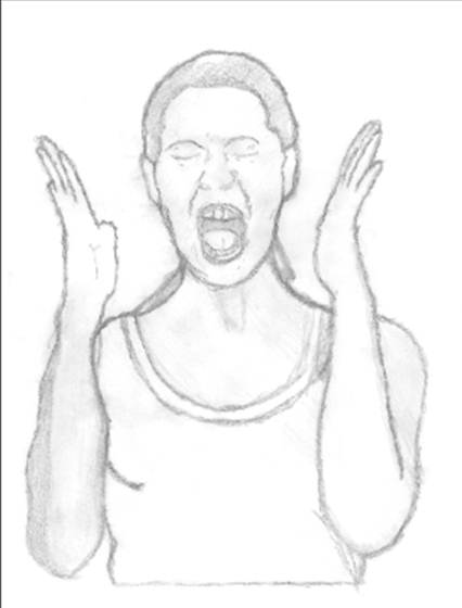
I found a picture suitable to convey what b movies are all about through the use of imagery and graph elements for the target market audience. . I shaded elements of this drawing to make this effective for the stages further throughout. This will enable me to add a variety of effects to this to me this suitable and professional for the target market audience. I used a light box to help me trace this drawing and graphical feature to get the features on this piece in the right places.
Step 2:
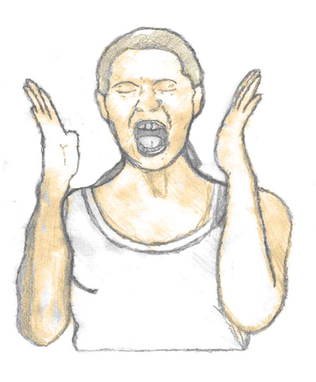
I then scanned this image into the computer to edit this on the Photoshop software on the computer to make this effective for the target market. 1st added the skin effect on the base of the image. I did this by seeing the color range select color to make this blend in with the shading base on the design to give this 3D effect to the design. I used a range of skin tone colors to make this realistic for the target market audience. I think by doing this will enable me to bring across the message in a visually expressive manner for the target market audience.
Step 3
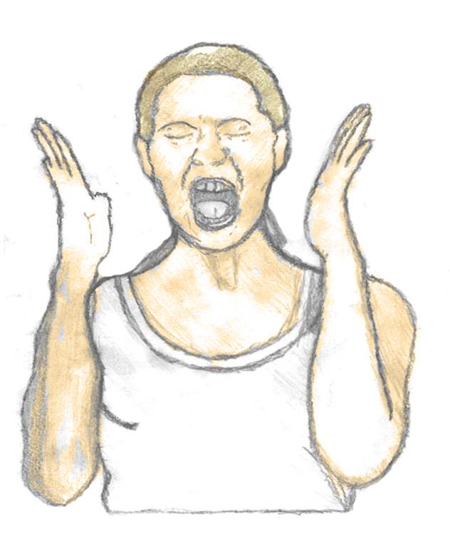
I then added a hair color to the design. I found a base color on Photoshop by using the form I used in the previous steps but didn’t use a range of colors like I did for the skin tones. If I was to redesign this I would use a range of brown tones to make this realistic for the target market and in a 3D form of manner to make this stand out from the background.
Step 4:
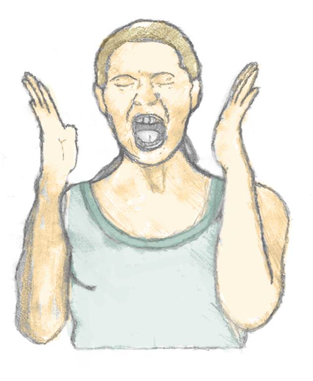
To finish off this design for my lobby and illustration I used a dark green color to suit the main body of the design. I blended this color in with the shading with the main body of the design. This makes it really realistic for the purpose of this design. The shading within this makes this suitable for the 3D movie lobby card design containing the use of a minimum block colors to make a great amount of effect for the target market audience.
Overall I think this design is very effective for my films lobby card. it represents and summarizes in a very well form of way through the use of imagery and graphical elements what b movies are all about and how through the use of Photoshop and graphical elements i could convey this. The use of the different skin tones within this imagery makes this suitable and effective for the target market audience. If I was to do this again I would use a more dramatic form of imagery to sum up a b movie and how horror is produced through this. I would also change the form of the color scheme to make this in a 3D form of manner and attractive for the target market audience. If I was to redesign this I would have outlined this to ensure this conveys a bold professional feel visually within the design to engage the younger generation. I could have also used the illustrator software to enhance a 3D feel within the illustration to add a modernised depth in to the design. I think by doing this by hand will enable my design work to be unique and original and enable me to consider how symbolic imagery can help symbolise the film. I think by doing this process was a great deal successful and enabled me to improve on many techniques to help produce a final product that conveys the film. once I designed this by hand I used the photoshop software and many elements within the base of this. For example: the curve tool (this enabled me to adapt and develop the colorization within the imagery as a whole and make this suitable for the target market audience), magic wand tool (this enabled me to delete elements within the poster design as a whole to make this blend in an effective complex manner conveying this in an effective form) and many more elements to ensure this is suitable and effective illustrative through the use of symbolic, typographic and graphical imagery. After looking back through my previous research I chose to stick with the cartoon theme and will enable me to import this in to my final design to fit in with the sci-fi theme and genre of the film. however to enable this to look a great deal more professional i could have used the illustrator software to convey a 3D modernised visual feel within the base of this design. This will also enable people to recognise this person thus enabling them to more likely watch the film. After looking at the target market audience I think conveying this in such a manner is more appealing to the younger generation thus not for filling the purpose for the film. I will now adapt this regarding these improvements and incorporate this within my design by using Photoshop blending options to convey a professional feel to the base of the design.
Analysis of lobby cards
Target for this lesson:
Look at modern poster designs for movies to enable me to help developing the design for the film to ensure this is in the best format visually for the target market audience (younger generation).
To enable me to develop and generate my ideas I looked into a great amount of detail posters within the era of the modern-day (2013) and how key elements within the era of time have influenced on their designs. Overall throughout this era of time The graphical elements within this time era has developed a great amount compared to the 1950 era. For example: the use of the computerized elements and typography has advanced techniques therefore making this more likely to be suitable for the target market audience. For example the use of the Photoshop and illustrator software to make elements in a 3D format to enable this to highlight key elements within the film. Furthermore software 3D programs in modern-day allows cartoon and graphical characters convey in such a manner suitable for the target market audience. In the modern era there are many elements that could be used such as printing techniques i.e.: mono printing and stenciling. This enables posters to print titles through the use of stenciling in a different form of print. This has been a great deal more developed compared to the 1950’s ear of design work. For example instead of the use of simplistic illustrations within the poster design the technology has a great deal more advanced through the use of photographical elements this visually helps convey the movie to enable people to relate to and understand a great amount.

What genre of the film is it and how would you know this just by looking at the poster design?
Just by looking at this through the photographic imagery used conveys a si-fi, magical fiction film. The typography used is in a graphical 3D format font standing out a great deal from the background. Using this within the 3D effect background enables this design to look effective and engaging for the target market audience. The photographic imagery of the film and elements relate well to the genre giving the audience the feel of that genre this is through the combination of graphical and photographic imagery. The typography used is very clear and in a simple form of manner to stand out a great deal from the black colouration suitable for the target market audience. I think using this graphical format of lettering style relates to the simple form of the modern style of movies. There is a little amount of graphical elements used within this witch doesn’t appeal to the target market audience a great deal but using this different style stands out from the graphical elements within the main poster design. The use of the blending styles within the photographical imagery and the base of the background enable this to stand out in a professional amount for the target market audience. The use of the black colouration within this conveys the sense a dark horror theme and conveys this in a great effective manner visually what the film is about and enables this to be suitable for the target market audience (teenagers).
The fact that it used 3D graphical and typographical imagery containing the bold colorization interests me. This will enable me to convey a modernized concept of the story within my own design conveying modernized elements to help convey this in the best format of manner possible for the target market audience. The use of the colorization within the base of the art work is blended conveying the story in a complex modernized format. Unlike old retro formats of designs that contain washed out retro format of colorization outlining the story in a manner the target market audience would be able to relate to and understand. However some elements within the base of this design do contain bold formats of colorization to highlight key importance within the base of this design. This enables this piece of art work to create and convey a dark sense of mysterious mood. By using dark black bold format of colorization and blended in photographical and typographical imagery with simplistic colors used conveys the story in a m]mysterious magical manner thus making this design a great deal successful and appealing for the younger generation that it is aimed at. The dark black lines used to convey the illustration and the movie within the format of this poster design are smooth blending in a great deal nicely within the other elements within the design thus conveying this in an effective and professional format for the target market audience. I think by analyzing this piece of art and the colorization the artists use to help convey a message will enable this to help me with my design work for the movie poster I will design and take on board these ideas to ensure my design work is a great deal effective.
The use of the using the washed out colorization and blending effect enables the photographical imagery to convey the film with the title in a graphical 3D manner contrasting well within the red and bold colorization also conveyed within this art work. Using the black colorization around the base of the photographical imagery conveys the sense of strong, classic, mysterious and powerful which enables this to stand out a great amount within the base of this design thus making this a great deal successful that the younger generation will be able to understand and relate to.The layout for this poster is in a refined and classic grid layout for the target market audience. The faces of the main characters in this poster are in line with the grid blocks the main title of the film is in the bottom half of this grid separating this from the photographic imagery of the main characters. This title balances the who design layout giving a mixture of photographic imagery and graphic elements in the bottom half of the design for the use of the typography relating well to the genre of the film. The main focus on the poster is mainly the use of the photographic imagery containing the main characters in the film. This takes up a great deal of amount of the poster blending in nicely with the black background making this eye-catching for the target audience. I think by using the title at the bottom of this poster enables and draws the target market audience in to the poster and the film. The typography and the color used within this style stands out a great deal from the rest of the elements within the poster. Using this graphical elements and the great amount of detail; within this blends in with the background drawing the audience’s eye away from the photographic imagery used. Although the type within this isn’t very big and a bit small it draws and appeals to the target market audience. I think overall that this layout used is very simple but effective. The very little of photographic images used within the design makes this more simple but effective with the use of a great amount of detail used within this and the graphical elements help relate to the film itself. The edit used on the images gives it a dark atmosphere giving the audience a view on the genre of the film and how this could be represented to the target market audience.
The Medias and techniques used within the base of this artwork are the use of the computeristic elements to help convey the film in a modernized manner to ensure this is a great deal suitable for the target market audience. To help convey the bright vibrant use of the colorization however also some dark vibrant use of the colorization within the base of this design to help convey the dark sense of mood within this illustrative piece of artwork. There is also used the writing technique to design the base of the poster design and plan what the story was going to be about. By using these elements I think has made a great influence within the design work. I think they have chosen to use these specific elements to convey this through bold look and blend these elements in to convey a professional and effective look within this design. However by using this computeristic modern-day effect within the base of this design it is slightly smudged to enhance this effect. The contrast used is a great deal bold and complex compared to the 1950’s style of work because the use of the high amount of contrast within the materials used. The media used is a great deal strong because of the materials available and used during the modern 201 time period containing a great deal vibrant use of the colorization thus blending the elements within the design. However within this art work this does not use a great amount of textures to enhance their message in a format people will be able to relate to and understand. I think by using and conveying the story through the use of photographical and computeristic is a great deal successful because it visually conveys the sense of boldness and smooth to ensure this is a great deal suitable for the target market audience. However although this technique conveys the story in a successful manner items such as marker pen or bold materials could be used to enhance the colorization used within the base of this design to ensure these elements are vibrant and stand out a great amount. I could recreate the same effect within this design for my own design work. For example, I could use the bold computeristic effect within the photographical format however could use the washed out hand drawn manner to help convey a twist within the modern design to convey the sense of a washed out dated sense.

Why do you think the visual graphical imagery has been chosen?
I think these have been chosen because through the use of the photographic imagery used it conveys a key part of the of a sci-fi theme. The photographic imagery combined with the graphical elements with the great amount of detail enables the target audience to get drawn in to this film. One section of this film was chosen for this poster but a range of elements throughout this giving this a feel of sci-fi horror style of fiction for the target market audience. I think using these images sums up in a simple but effective way through the use of imagery what magic and the film is about. This conveys through the use of the dark format of colour scheme and effective typographic imagery conveying the era of that time. The use of the beam of light within this colouration visually enables these elements to stand out a great amount from the base of this therefore appealing for the target market audience. The use of the symbolic apple within this symbolises the sense of immortality In Celtic and Norse mythology, the apple is conveyed as a visual symbol of rebirth. An apple tree springs from the grave of the Celtic lover Ailinn, symbolizing rebirth in death. This relates visually in an effective manner vampires and how they are immortal. The use of the bright sense of red within this conveys the sense of love and conveyed with the symbolic colorization of the black shows how relationships within the film become dark and complicated. The use of the symbolic imagery of the moon of the ending of events in life thus relating to the film with the theme of vampires and rebirth.
What genre of the film is it and how would you know this just by looking at the poster?
Just by looking at this through the photographic imagery used conveys a si-fi, magical fiction film. The typography used is in a graphical 3D format font standing out a great deal from the background. Using this within the 3D effect background enables this design to look effective and engaging for the target market audience. The photographic imagery of the film and elements relate well to the genre giving the audience the feel of that genre this is through the combination of graphical and photographic imagery. The typography used is very clear and in a simple form of manner to stand out a great deal from the black colouration suitable for the target market audience. I think using this graphical format of lettering style relates to the simple form of the modern style of movies. There is a little amount of graphical elements used within this witch doesn’t appeal to the target market audience a great deal but using this different style stands out from the graphical elements within the main poster design. The use of the blending styles within the photographical imagery and the base of the background enable this to stand out in a professional amount for the target market audience. The use of the black colouration within this conveys the sense a dark horror theme and conveys this in a great effective manner visually what the film is about and enables this to be suitable for the target market audience (teenagers).
Looking at the layout and composition:
The layout for this poster is symmetrical design. The horizontal line directly through the poster design. Using this form will help designers to make symmetrical designs to enable this to suit the purpose of the poster. This helps keep the photographic images in place within in the design to help keep this layout in place. Although the typography takes a great deal part within this design I think the main section within this design is the photographic imagery of the two main characters within the design. Using this draws the target market in to watching the film containing a great amount of detail within this standing out from the darkness within the background. This takes up a great deal of amount of the poster blending in nicely with the black background making this eye-catching for the target audience. The main title of the film runs across the bottom of the poster design. I think that this is really effective because the font and the size of this are in a large-scale making it easy to read for the target market audience. I think overall that this layout used is very simple but effective. The very little of photographic images used within the design makes this more simple but effective with the use of a great amount of detail used within this and the graphical elements help relate to the film itself. the edit used on the images gives it a dark atmosphere giving the audience a view on the genre of the film and how this could be represented to the target market audience.
Overall I think this design is a great deal effective and conveys the artist message in an effective manner for the target market audience. To improve this work however if I was to redesign this the colorization could be a great amount more hand drawn washed out elements to convey a twist sense within the base of this design.to ensure this is a great deal original. After looking back at previous techniques and textures used within different styles of artwork textures such as mud could be blended in to this piece to enhance the message a great deal further through a visual manner. I think the artists intention to convey the sense of a mysterious horror romance feel within the base of this design in a visual format of manner is very clear to the audience, the use of the visual simplistic language is used conveyed with typographical imagery to show the story. I agree with the artist’s message because through the use of this art it conveys a sense or horror feel within the use of the format of colorization for the younger generation format that they will be able to relate to and understand. I think my favorite part of the base of the poster design is the use of how the typographical imagery is blended in a bold format from the artistic imagery to convey in a clear format of manner what the story is about visually not over powering the symbolic imagery within the base of this design. The use of the hidden message within the poster design cleverly relating to the sense of a mysterious boy based on a true story. Relating to the sense of what happens in a realistic life therefore making this a great deal effective and suitable for the target market audience as a whole. This artistic piece has inspired me to look in to depth about what imagery I could use to convey a hidden meaning for the target market audience in the best format of manner possible. Furthermore how I could consider the use of typography can help convey the sci-fi genre of the film in a modernized and an effective manner suitable for the target market audience. I will take these elements on board to ensure within my design relates effectively to the film it is based on. After looking in to detail within the design I could use artistic elements in a creative form of manner and combine this with typographical elements within the Photoshop software to ensure this is conveyed in the best format of manner possible for the target market audience. I could also consider the sense of positioning and scale so the information about the main comic strip is in proportion with all of the elements to ensure this design is in an effective style format. This will enable me to position the typography in an effective manner to ensure this is not over powering the main symbolic graphical element to convey the story through the use of visual and typographical elements.

This is the most common movie poster used within the era of time.
Why do you think these things have been chosen?
I think these have been chosen because through the use of the photographic imagery used it conveys a key part of the of a horror theme. The photographic imagery combined with the graphical elements with the great amount of detail enables the target audience to get drawn in to this film. One section of this film was chosen for this poster but a range of elements throughout this giving this a feel of horror style of fiction for the target market audience. I think using these images sums up in a simple but effective way through the use of imagery what magic and the film is about. This conveys through the use of the dark format of colour scheme and effective typographic imagery conveying the era of that time. Unlike the 1950’s era the colouration and the length of graphical elements used within this enables the main body of the photographical imagery top blend in nicely through the use of smoke effects whereas within 1950 the colour sheame was washes out and conveyed the message through the use of simple symbolic shapes thus making this a great deal less effective for the target market audience.
What genre of the film is it and how would you know this just by looking at the lobby card? Just by looking at this through the photographic imagery used conveys a horror fiction film. The typography used is in a graphical 2D format font standing out a great deal from the background. Using this within the 2D effect background enables this design to look effective and engaging for the target market audience. The photographic imagery of the film and elements relate well to the genre giving the audience the feel of that genre this is through the combination of graphical and photographic imagery. The typography used is very clear and in a simple form of manner to stand out a great deal from the black colouration suitable for the target market audience. I think using this graphical format of lettering style relates to the simple form of the modern style of movies. There is a little amount of graphical elements used within this witch doesn’t appeal to the target market audience a great deal but using this different style stands out from the graphical elements within the main poster design. The use of the blending styles within the photographical imagery and the base of the background enable this to stand out in a professional amount for the target market audience. The use of the black colouration within this conveys the sense a dark horror theme and conveys this in a great effective manner visually what the film is about and enables this to be suitable for the target market audience (teenagers). The use of the red colouration within the typographic text conveys the sense of horror blood and gore visually conveying the genre of the film. Compared to the 1950 style poster format a great deal more colouration is used to symbolise the genre of the film compared to the washed out colour scheme and lack of effects within that era of time.
Layout and composition:
The layout of this poster is in a z layout. This is a popular form of layout used by marketing. These elements are often placed at the top and bottom of an ad, where the logo provides a stopping point for the eye and leads it back into the page. In this poster the headlines lead the eye from left to right across the top of the poster. The diagonal line within this poster leads the eye to the bottom left of the poster is more difficult to discern than the diagonal line. In this poster, the bottom of the “Z” is used for pertinent movie information. There is one main photographic image within this design not making this too complicated in a simple form of way for the target audience to understand. Using a lack of colors in the base background of this enables the main title of the movie to stand out a great amount. The bright red for the typography relates to the genre of horror relating to blood and gore. By using this visually doesn’t give too much information away to the target market audience but just enough to make them want to see the film. I think overall that this layout used is very simple but effective. The very little of photographic image used within the design makes this more simple but effective with the use of a great amount of detail used within this and the graphical elements help relate to the film itself. The edit used on the image gives it a dark atmosphere giving the audience a view on the genre of the film and how this could be represented to the target market audience.
Overall I think this design is a great deal effective and conveys the artist message in an effective manner for the target market audience. To improve this work however if I was to redesign this the colorization could be a great amount more vibrant and in a bold format to ensure this stands out a great amount. After looking back at previous techniques and textures used within different styles of artwork textures such as mud could be blended in to this piece to enhance the message a great deal further through a visual manner. I think the artists intention to convey the sense of a a horror sense within the movie in a visual manner in the format of a poster design this is very clear to the audience, the use of the visual simplistic language is used conveyed with typographical imagery to show the story. I agree with the artist’s message because through the use of this art it conveys a graphical horror message for the younger generation in a format that they will be able to relate to and understand. I think my favorite part of the base of the poster design is the use of how the typographical imagery is blended in a bold format from the artistic imagery to convey in a clear format of manner what the story is about visually not over powering the symbolic graphical within the base of this design. The use of the hidden message within this cleverly relating to the sense based on a true story. Relating to the sense of what happens in a realistic life therefore making this a great deal effective and suitable for the target market audience as a whole. This artistic piece has inspired me to look in to depth about what imagery I could use to convey a hidden meaning for the target market audience in the best format of manner possible. Furthermore how I could consider the use of typography can help convey the film in a modernized and an effective manner suitable for the target market audience. I will take these elements on board to ensure within my design relates effectively to the sci-fi genre it is based on. After looking in to detail within the design I could use artistic elements in a creative form of manner and combine this with typographical elements within the Photoshop software to ensure this is conveyed in the best format of manner possible for the target market audience. I could also consider the sense of positioning and scale so the information about the main poster is in proportion with all of the elements to ensure this design is in an effective style format. This will enable me to position the typography in an effective manner to ensure this is not over powering the main symbolic graphical element to convey the story through the use of visual and typographical elements.
Analysis of modern lobby card
Target for this lesson: Identify key elements and correlation between film and lobby card.

Why do you think these things have been chosen?
I think these have been chosen because through the use of the photographic imagery used it conveys a key part of the of of space theme. The photographic imagery combined with the graphical elements with the great amount of detail enables the target audience to get drawn in to this film. Not only one section of this film was chosen for this poster but a range of elements throughout this giving this a feel of space and science fiction for the target market audience. I think using these images sums up in a simple but effective way through the use of imagery what space and the film is about.
What genre of the film is it and how would you know this just by looking at the lobby card?
Just by looking at this through the photographic imagery used conveys a si fi, science fiction film. The typography used is in a block letter font standing out a great deal from the background. Using this within the 3d effect background enables this design to look effective and engaging for the target market audience. The photographic imagery of the rocket and space elements relate well to the genre giving the audience the feel of that genre this is through the combination of graphical and photographic imagery. The typography used is very clear and in a simple form of manner to stand out a great deal suitable for the target market audience. I think using this block lettering style relates to the simple form of the b movies that were used in the past. There is a little amount of graphical elements used within this which doesn’t appeal to the target market a great deal but using this different style stands out from the graphical elements within the main poster design.
Overall I think this design is a great deal effective and conveys the artist message in an effective manner for the target market audience. To improve this work however if I was to redesign this the colorization could be a great amount more vibrant and in a bold format to ensure this stands out a great amount. After looking back at previous techniques and textures used within different styles of artwork textures such as mud could be blended in to this piece to enhance the message a great deal further through a visual manner. I think the artists intention to convey the sense of a fun attractive sense within the movie in a visual manner in the format of a poster design this is very clear to the audience, the use of the visual simplistic language is used conveyed with typographical imagery to show the story. I agree with the artist’s message because through the use of this art it conveys a graphical fun message for the younger generation in a format that they will be able to relate to and understand. I think my favorite part of the base of the poster design is the use of how the typographical imagery is blended in a bold format from the artistic imagery to convey in a clear format of manner what the story is about visually not over powering the symbolic graphical within the base of this design. The use of the hidden message within this cleverly relating to the sense based on a story. Relating to the sense of what happens in a realistic life therefore making this a great deal effective and suitable for the target market audience as a whole. This artistic piece has inspired me to look in to depth about what imagery I could use to convey a hidden meaning for the target market audience in the best format of manner possible. Furthermore how I could consider the use of typography can help convey the film in an old format retro style and an effective manner suitable for the target market audience. I will take these elements on board to ensure within my design relates effectively to the genre it is based on. After looking in to detail within the design I could use artistic elements in a creative form of manner and combine this with typographical elements within the Photoshop software to ensure this is conveyed in the best format of manner possible for the target market audience. I could also consider the sense of positioning and scale so the information about the main poster is in proportion with all of the elements to ensure this design is in an effective style format. This will enable me to position the typography in an effective manner to ensure this is not over powering the main symbolic graphical element to convey the story through the use of visual and typographical elements. The use of the 3d elements within the base of this design adds to this modernised effect within the poster enabling this design to stand out a great amount to attract the younger generation. However the use of the colourisation within the base of this could be in a graphical vibrant manner to attract the target market audience. (Younger generation). However the use of the bold format of colourisation within the base of the typography conveying the title of the film is in a bold manner enabling this to stand out a great amount within the base of the retro format within the poster design. I think the use of the lack of the graphical imagery used within this enables the poster design to have the main focus on the typographical imagery. By analysing this will now enable me to compare and analysed how the movie poster has developed and formed over a period of time and how techniques and materials effect the design process to ensure this is a great deal suitable for the target market audience.
After looking at this what ideas have you got for your own design?
After looking through my previous research I could transform and manipulated photographic images and use the Photoshop and illustrator software to help me do this. And use a sense of 3d typography as well as 3d objects to make the main title stand out a great deal amount from the main background. I will also use the retro effect for my own design to help bring across the genre of the film visually. And make the elements suitable for the purpose of the poster. I will also use a range of graphical backgrounds or even just one simple block color by doing this will enable me to blend the imagery in with this to make it look smooth and professional for its purpose. I will also use a range of images throughout the film conveying different parts of the movie in a simple graphical way suitable for the target market audience.


Why do you think these things have been chosen and what genre of the film is it and how would you know this just by looking at the lobby card?
I think these have been chosen because through the use of the cartoonist imagery used it conveys a key part of the of the science fiction theme. The cartoonist images within the poster imagery combined with the graphical elements with the great amount of detail enables the target audience to get drawn in to this film. Not only one section of this film was chosen for this poster but a range of elements throughout this giving this a feel of danger and a horrific feel to the poster. The use of the air craft resembles the science fiction genre back in the 1960′s era. The images used are in a great amount of detail by converting photographic images in a cartoon feel to suit the target market audience. By using the range of all of the coloring styles on the variation of images engages. The image of the man on the center of the badge represents rage by the way it is set out for the genre of the film. The lettering used in the middle of the poster is in a really simple form of style but quiet hard to read from a distance. There is not graphical elements within this and not really 3d and attractive for the target market audience. I think using this block lettering style relates to the simple form of the b movies that were used in the past. There is a little amount of graphical elements used within this which doesn’t appeal to the target market a great deal but using this different style stands out from the graphical elements within the main poster design. i think overall this design was designed mainly on the computer and edited photographic images to make these in a form of cartoonist graphical elements. I think this is in a very engaging form of style contains a contrast of colors blending in nicely with each other making this look attractive for the target market audience.
Overall I think this design is a great deal effective and conveys the artist message in an effective manner for the target market audience. To improve this work however if I was to redesign this the colorization could be a great amount more washed out and retro to convey the sense of an old and new techniques used to ensure this design is a great deal suitable for the target market audience. After looking back at previous techniques and textures used within different styles of artwork textures such as mud could be blended in to this piece to enhance the message a great deal further through a visual manner. I think the artists intention to convey the sense of a fun attractive sense within the movie in a visual manner in the format of a poster design this is very clear to the audience, the use of the visual simplistic language is used conveyed with typographical imagery to show the story. I agree with the artist’s message because through the use of this art it conveys a graphical fun message for the younger generation in a format that they will be able to relate to and understand. I think my favorite part of the base of the poster design is the use of how the typographical imagery is in a 3d complex format to convey the film in the best format of manner possible. This allows this to stand out a great amount from this design in a clear format of manner what the story is about visually not over powering the symbolic graphical within the base of this design. The use of the hidden message within this cleverly relating to the sense based on a story. Relating to the sense of what happens in a realistic life therefore making this a great deal effective and suitable for the target market audience as a whole. This artistic piece has inspired me to look in to depth about what imagery I could use to convey a hidden meaning for the target market audience in the best format of manner possible.
After looking at this what ideas have you got for your own design?
After looking through my previous research I could transform and manipulate photographic images and use the Photoshop and illustrator software to help me do this. And use a sense of 3d typography as well as 3d objects to make the main title stand out a great deal amount from the main background. I will also use the retro effect for my own design to help bring across the genre of the film visually. And make the elements suitable for the purpose of the poster. I will also use a range of graphical backgrounds or even just one simple block color by doing this will enable me to blend the imagery in with this to make it look smooth and professional for its purpose. i will also use a range of images throughout the film conveying different parts of the movie in a simple graphical way suitable for the target market audience.


Why do you think these things have been chosen and what genre of the film is it and how would you know this just by looking at the lobby card?
I think these have been chosen because through the use of the cartoonist imagery used it conveys a key part of the of the horror fiction theme. The cartoonist images within the poster imagery combined with the graphical elements with the great amount of detail enables the target audience to get drawn in to this film. Not only one section of this film was chosen for this poster but a range of elements throughout this giving this a feel of danger and a horrific feel to the poster. Also these images are in a form of graphical features the lines are very thin and not very realistic for the target market audience.by using the range of all of the coloring styles on the variation of images engages. the image of the creature on the main body of the poster doesn’t look very realistic and the shading used on the main body of this character blends in with the background conveying to the target audience a sense of mystery and that there is something to hide in the movie convey this through the use of the graphical elements suitable for a range of people. I think overall this design was designed mainly on the computer and edited photographic images to make these in a form of cartoonist graphical elements. The creature used represents rage by the way it is set out for the genre of the film. the lettering used in the bottom section of the poster engages by using the contrast of the colors makes the dark shade of blue stand out a great deal from the red having a slight 3d feel to the typography used. Realistically this is very simple form for graphics using a simple block form of lettering not relating to the genre of this film in a sense.
By analysing this will now enable me to compare and analysed how the movie poster has developed and formed over a period of time and how techniques and materials effect the design process to ensure this is a great deal suitable for the target market audience.
Overall I think this design is a great deal effective and conveys the artist message in an effective manner for the target market audience. To improve this work however if I was to redesign this the colorization could be a great amount more vibrant and in a bold format to ensure this stands out a great amount. After looking back at previous techniques and textures used within different styles of artwork textures such as mud could be blended in to this piece to enhance the message a great deal further through a visual manner. I think the artists intention to convey the sense of a fun attractive sense within the movie in a visual manner in the format of a poster design this is very clear to the audience, the use of the visual simplistic language is used conveyed with typographical imagery to show the story. I agree with the artist’s message because through the use of this art it conveys a graphical fun message for the younger generation in a format that they will be able to relate to and understand. I think my favorite part of the base of the poster design is the use of how the typographical imagery is in a bold simplistic format typical of that era of time blending in well with the graphical drawings designed for the characters. This artistic piece has inspired me to look in to depth about what imagery I could use and incorporate the use of my hand drawn imagery to ensure my designs and ideas are a great deal suitable and original for the target market audience. (Younger generation). Furthermore how I could consider the use of typography can help convey the film in an old format retro style and an effective manner suitable for the target market audience. I will take these elements on board to ensure within my design relates effectively to the genre it is based on. After looking in to detail within the design I could use artistic elements in a creative form of manner and combine this with typographical elements within the Photoshop software to ensure this is conveyed in the best format of manner possible for the target market audience. I could also consider the sense of positioning and scale so the information about the main poster is in proportion with all of the elements to ensure this design is in an effective style format. This will enable me to position the typography in an effective manner to ensure this is not over powering the main symbolic graphical element to convey the story through the use of visual and typographical elements. The use of the 3d artistic elements within the base of this design adds to this simplistic old retro effect within the poster enabling this design to stand out a great amount to attract the younger generation. However the use of the colourisation within the base of this could be in a graphical vibrant manner to attract the target market audience. (Younger generation). However the use of the bold format of colourisation within the base of the typography conveying the title of the film is in a bold manner enabling this to stand out a great amount within the base of the retro format within the poster design.
After looking at this what ideas have you got for your own design?
After looking through my previous research i could transom and manipulate photographic images and use the Photoshop and illustrator software to help me do this. And use a sense of 3d typography as well as 3d objects to make the main title stand out a great deal amount from the main background. I will also use the retro effect for my own design to help bring across the genre of the film visually. And make the elements suitable for the purpose of the poster. I will also use a range of graphical backgrounds or even just one simple block color by doing this will enable me to blend the imagery in with this to make it look smooth and professional for its purpose. I will also use a range of images throughout the film conveying different parts of the movie in a simple graphical way suitable for the target market audience. Furthermore i will use dramatic and engaging film clips on this and transform these in to a graphical feel and after looking at all the old style of posters I will use this in a simple form by containing thin lines with washed out color effects to make this look more the 1950′s era.
Introduction to lobby card brief
The target for this lesson is to research and analyze past lobby card designs. i am going to look at 6 lobby cards and compare them to modern day items and how through the use of the imagery it conveys a message what the b movie is all about for the target market audience.


This card is advertising a genre of a si fi B-movie. You know this by through the use of the imagery used within the cards. Such as the main body image of the card. Through the use of the imagery it conveys a futuristic film. The illustrations used on this is a range such a photographic imagery and well and cartoon imagery to help convey the movie. The graphical image of the rocket at the side of the lobby is quiet realistic for the background containing the use of the 3d effect for part of the design. I think that this image might have been created on the computer and edited into the main lobby card design. I think the main photographic picture on the base of the design the colors are washed out giving it a retro look to the design. There isn’t a great amount of detail in this making this look less realistic for the target market audience. There are 3d elements within this image but with the washed color this doesn’t make it very appealing to the target market. The size of this image in the corner of the page making the main layout of this card simple but conveys the film very well through the use of the imagery. Using this combination of graphical imagery and photographic conveys the genre of the film a graphical but realistic as well throughout. i think the graphical photo element within this design might have been edited on the computer from an original realistic photo and washed the colors out from the photo in to an old style washed out color scheme.
The lettering used on this is in a very simple block color but the font style through the use of the typography conveys the genre of the film as well. Such as the fun style of font conveys a funny comedy through the genre of si-fi for the target market audience. Although this typography isn’t in 3d it stands out a great deal from the graphical style of background.
I think the modern poster for a movie (displayed above) is more realistic than the lobby card for project moon base. More graphical elements are used such as 3d typography related to the genre of the film and the use of the photographic effects. This has a layout which blends in the imagery in a smooth form of way. However he lobby card have a very simple layout with imagery separated from each other being less realistic for the target market on the film. There is a great amount of media effects used in the modern poster mainly in the use of the typography. Giving across a dark message whereas the lobby card used a very simple 2d form of lettering. Also the color used in the modern poster is a combination of dark and bright graphical color whereas the lobby card contains washed out retro color with isn’t very bright and attractive for the target market. There is a large scale of photographic imagery in the modern poster blending i with the background eye catching for the audience however the lobby has a lack of range of colorization.


This card is advertising a genre of a si fi B-movie. You know this by through the use of the imagery used within the cards. Such as the lettering at the top base of the card itself. This is in a 3d style of typography but contains washed out colors not appealing to the target market a great deal amount. The illustrations used on this is a range such a photographic imagery and well and cartoon imagery to help convey the movie. The graphical image and typography at the top base conveys a futuristic feel to the design. There is a use of pastille styles also to blend in a range of colors to help convey this message to the target audience. the photographic image scale used is taking up most of the base of the card with a 3d feel to the design making this effective for the target market. There is also a lack of color on the photographic image. There are only base colors used on this design with a retro look to the design. I think that this was created by the use of the computer although this has the lack of graphics used.
The lettering used on this is in a very simple block color but the font style through the use of the typography conveys the genre of the film as well. Such as the fun style of font conveys a funny comedy through the genre of si-fi for the target market audience. although this typography is in 3d it could be improving to make this more suitable for thee target market audience.
I think the modern poster for a movie (displayed above) is more realistic than the lobby card for 4d man. More graphical elements are used such as 3d typography related to the genre of the film and the use of the photographic effects. This has a layout which blends in the imagery in a smooth form of way. However he lobby card have a very simple layout with imagery separated from each other being less realistic for the target market on the film. there is a great amount of media effects used in the modern poster mainly in the use of the typography. Images are used within the typography do help convey this whereas the lobby card contains a very simple washed out retro feel of typography. A dark form of colors are used to bring across the genre of the movie horror and the graphic features used on this poster is very clear and consist and for the target market. There is a large scale of photographic imagery in the modern poster blending I with the background eye catching for the audience however the lobby has a lack of range of colorization.
This is the most common movie poster used within the era of time.
Why do you think these things have been chosen?
I think these have been chosen because through the use of the photographic imagery used it conveys a key part of the of space theme. The photographic imagery combined with the graphical elements with the great amount of detail enables the target audience to get drawn in to this film. Not only one section of this film was chosen for this poster but a range of elements throughout this giving this a feel of space and science fiction for the target market audience. I think using these images sums up in a simple but effective way through the use of imagery what space and the film is about. This conveys through the use of the washed out colour scheme and the lack of the effective typographic imagery the era of that time conveying an old dated retro feel to the design.
What genre of the film is it and how would you know this just by looking at the lobby card?
Just by looking at this through the photographic imagery used conveys a si-fi, science fiction film. The typography used is in a block letter font standing out a great deal from the background. Using this within the 3d effect background enables this design to look effective and engaging for the target market audience. The photographic imagery of the rocket and space elements relate well to the genre giving the audience the feel of that genre this is through the combination of graphical and photographic imagery. The typography used is very clear and in a simple form of manner to stand out a great deal suitable for the target market audience. I think using this block lettering style relates to the simple form of the b movies that were used in the past. There is a little amount of graphical elements used within this which doesn’t appeal to the target market a great deal but using this different style stands out from the graphical elements within the main poster design. Although the typographic imagery could be in a greater complex format to enable the title of the film to stand out a great amount and to ensure this is suitable for the target market audience.
The Medias and techniques used within the base of this artwork are the use of the of the hand drawn cartoons in a simplistic retro format of manner to help convey the bright vibrant use of the colorization however also some washed out elements to help convey the mood within this illustrative piece of artwork. The designer also used the writing technique to design the base of the poster design and plan what the story was going to be about. By using these elements I think has made a great influence within the design work. I think they have chosen to use these specific elements to convey this through the washed out look and blend these elements in to convey a professional and effective look within this design. However by using this retro simplistic 1950’s effect within the scenery of the design it is slightly smudged to enhance this effect. The contrast used is a great deal rough because the use of the low contrast within the materials used. The media used is weak because of the materials available and used during the 1950′s time period containing less vibrant use of the colorization thus blending the elements within the design. However within this art work this does not use a great amount of textures to enhance their message in a format people will be able to relate to and understand. I think by using and conveying the story through the use of drawings and watercolor paint is a great deal successful because it visually conveys the sense of peaceful and smooth to ensure this is a great deal suitable for the target market audience. However although this technique conveys the story in an successful manner items such as marker pen or bold materials could be used to enhance the colorization used within the base of this design to ensure these elements are vibrant and stand out a great amount. I could recreate the same effect within this design for my own design work. For example, I could use the washed out paint effect within the cartoon format however could use the computerized manner and use the Photoshop painting software and use many elements within the base of this to convey the washed out dated sense of colorization within the design.
Overall I think this design is a great deal effective and conveys the artist message in an effective manner for the target market audience. To improve this work however if I was to redesign this the colorization could be a great amount more vibrant and in a bold format to ensure this stands out a great amount. Furthermore this style could be in a modernized 3d format to develop a higher depth within the design. The detail within the design could be a greater more to help convey the sense of realistic elements within this design. After looking back at previous techniques and textures used within different styles of artwork textures such as space textures could be blended in to this piece to enhance the message a great deal further through a visual manner. I think the artists intention to convey the sense of a space scene is very clear to the audience, the use of the visual simplistic language is used conveyed with typographical imagery to show the story. I agree with the artist’s message because through the use of this art it conveys a learning message for the younger generation how to behave in a format that they will be able to relate to and understand. I think my favorite part of the base of the poster design is the use of how the typographical imagery is blended in a bold format from the artistic imagery to convey in a clear format of manner what the story is about visually not over powering the symbolic imagery within the base of this design. Relating to the sense of what happens in a realistic life therefore making this a great deal effective and suitable for the target market audience as a whole. This artistic piece has inspired me to look in to depth about what imagery I could use to convey a hidden meaning for the target market audience in the best format of manner possible. Furthermore how I could consider the use of typography can help convey the sifi retro 1950’s poster design in a modernized and an effective manner suitable for the target market audience. I will take these elements on board to ensure within my design relates effectively to the sifi genre it is based on. After looking in to detail within the design I could use artistic elements in a creative form of manner and combine this with typographical elements within the Photoshop software to ensure this is conveyed in the best format of manner possible for the target market audience. And the design is a great deal original. I could also consider the sense of positioning and scale so the information about the main poster design is in proportion with all of the elements to ensure this design is in an effective style format. This will enable me to position the typography in an effective manner to ensure this is not over powering the main symbolic graphical element to convey the story through the use of visual and typographical elements.
This card is advertising a genre of monster/science-fiction films. You know this by through the use of the imagery used within the cards. Such as the lettering at the bottom base of the card itself. There is a range of typography used within this main title of the film. as well as the font size. The main key words in the title of the film are a different font size than the less important words. The illustrations used on this is a range such an artistic imagery and well and cartoon imagery to help convey the movie. The graphical image next to the main photo on the lobby card is very effective because it conveys a different style of imagery for all the target market audience. There is a range of imagery used to engage and draw people in to make them want to see the film. The title used along the bottom of the card i think could be bigger because the main art image on the card draws this away from the purpose. the artistic image scale used is taking up most of the base of the card with a 3d feel to the design making this effective for the target market. There is also a lack of color on the artistic image. the main color scheme of this is very dark context of colors which doesn’t draw the target market in a great deal of amount which doesn’t for fill the purpose. The red ribbon displaying the title of the movie stands out a great deal from the rest of the lobby card. The typography could be in a more interesting style to help convey the genre of the film. The colors used are very bland giving this design a retro look for the target market audience.

This card is advertising a genre of monster/science-fiction films. You know this by through the use of the imagery used within the cards. Such as the lettering at the main body of the lobby card. The typography is in a fun style of font making this stand out a great deal from the cartoonist background for the target market audience (teenagers and children). I think using this bland yellow background on the font adds a great effect to the design. Although this font is very attractive and suits the design I think I could convey the genre of the film a great deal more. This could be in different sizes to make this more engaging and a range of colors could be used to suit the film. I think the lettering in the top of the design in italics also adds a retro effect to the design. The angle that is used makes this more interesting and key for the design. The graphic imagery used on the base of the design draws the younger generation in watching the film. With a 3d feel to the design making this effective for the target market. There is also a lack of color on the artistic image. The main color scheme of this is very bland but does contain a range of graphical elements which I think was edited on the computer in a very simple form with the lack of detail and thin lines used.
This card is advertising a genre of a science fiction/space b movie. This is conveyed through not only the imagery used such as photographic and cartoon but also through the use of the typography. The typography used is a very simple old version for the main title body. In the form of block lettering this stands out a great deal from the main background with a washed out color giving this style a retro look design. The washed out space background is very effective for the target audience. By using this will enable the key information to stand out a great deal for the target market audience from a great distance. The 3d photographic image on the main base of the card in a 3d form is edited on the computer to make it slightly cartoonist to fit the whole main design and the purpose of this to help convey the movie. This could be in different sizes to make this more engaging and a range of colors could be used to suit the film. I think overall this main design as well as the main body of graphics used within this was edited on the computer in a very simple form with the lack of detail and thin lines used.
